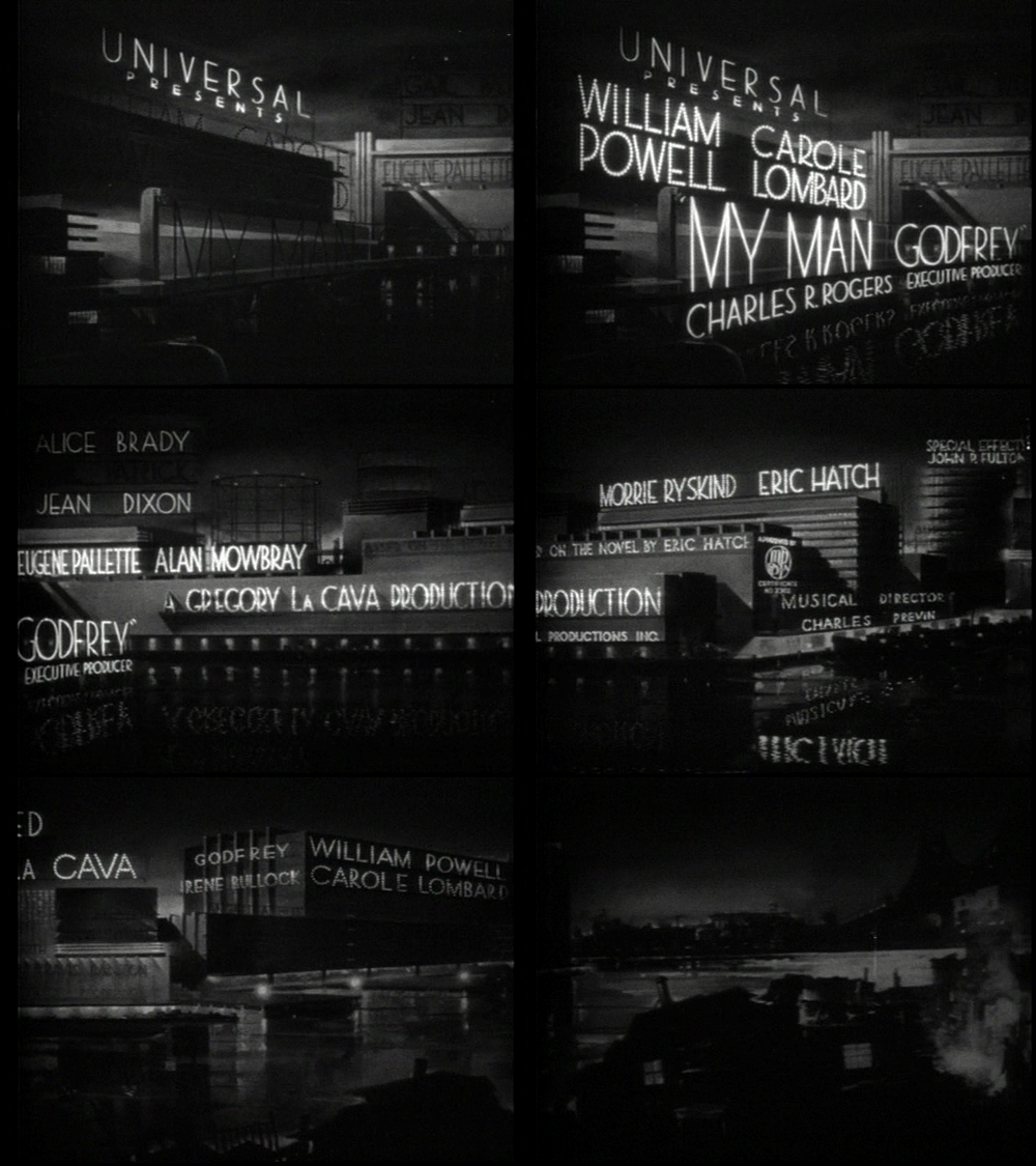
My Man Godfrey (1936) has always been one of my all-time favorite films. The Godfrey of the title is a derelict (William Powell) who, after meeting wealthy and eccentric Irene Bullock (Carole Lombard), is hired as a butler in the zany Bullock household. It’s a really fun hour and a half, and if you haven’t seen it, I highly recommend that you do.
Godfrey‘s opening credits are very distinctive and very well-integrated with the storyline. The names (and titles, if necessary) of the cast and crew are designed like neon signs on buildings near the riverfront. The camera pans right, showing all the names in turn, ending on a painting of the city dump, where Godfrey, along with other “forgotten men,” makes his home. The painting dissolves into the first shot of the film.

I’ve included the screencaps below in case anyone wants to get a closer look.
The Godfrey typeface’s geometrical forms and low bars are very typical of the art deco type commonly used in the 1920s and 1930s. After some research, I think the closest you can get today is probably Semplicita Pro by CanadaType. You can “test drive” it here.


Oh God, I’ve never seen that one!
Speaking of great movies, the other nite we watched the Big Sleep! Wow, I forgot how great the dialogue was…….written by Faulkner!
Val…I can’t believe it LOL If you click the link in the beginning of the post, you can watch Godfrey online for free…I should probably have said that somewhere. The Big Sleep is another of my all-time faves. Yes, brilliant dialogue. Everybody’s gotta eat, I guess 🙂
I appreciate your looks at typography in film, Paula. Plus, this is one great movie title sequence (an aspect I really adore). Thanks for this.
You’re welcome and thanks for your kind words, Michael. Typography is sort of an obsession of mine, I have a lot of fun making these 🙂
Great job on the animation. It is a beautiful font, and this has to be one of the most creative opening sequences of all time.
Thank you. I agree, it was really kind of ahead of its time. I find myself wondering how they got the type to do that without all the fancy software we have now 🙂
Hi, Paula and company:
Opening credits rarely get the loving thy deserve. This one must have taken hours of splicing and taping, With just the right amount of Neon.
William Powell is superb and Godfrey. With his quick quips and facial expressions amongst the elites, hoity toity and snobs. Much more down to earth opposite Carole Lombard. Who comes across as a more spoiled and vulnerable Myrna Loy.
A great choice for discussion!
Thanks Jack! Yes, this sequence that lasts a minute or two at most must have taken hours of painstaking work. I’m not even really sure how some of it was done. Agree re: Powell, he is excellent. His ability to be outwardly subservient but still show us what Godfrey REALLY thinks of the society people is unmatched.
Do you mean Myrna Loy in the Nora Charles role?
Thank you for this! I LOVE My Man Godfrey. It is one of my faves of all time. I never really paid too much attention to the sequence you put up. Nice of you to do so. Love it. Thank you.
You’re very welcome T, and thanks. It is an amazing sequence, especially since there wasn’t the anywhere near the digital technology we are accustomed to today. I’d love to know how they did this without iMovie 🙂
First, that’s an awesome font that you linked to…I’m going to have use that on *something* and soon! Also, don’t get me started on credits, because I will bore you with how great the closing credits are in West Side Story!
Thanks Joel, I just love it. I too buy fonts before I have something to use them on. Re: West Side Story….Is there a guest blog post in there somewhere perhaps…? 🙂